Blog ENG
Visualization of high-dimensional data
In the world of machine learning, one often deals with datasets whose dimensions (number of features) are in the thousands. Also, since we as humans are not capable of perceiving beyond the third dimension, such data makes it very difficult for us to find any meaningful pattern within it and just that is actually the topic of this blog post, the methods by which we can take high-dimensional data that is impossible to visualize and somehow bring it down into 2D or 3D space and visualize it because, as the famous saying goes, a picture is worth a thousand words. There are many methods for achieving this, but here we will touch on only three that are among the most popular: PCA, t-SNE and UMAP. Each of these methods will also be tested on a standard MNIST dataset of handwritten digits so that we can see how well each method performs its task.
PCA (Principal Component Analysis)
PCA is perhaps the most well-known method for data dimensionality reduction. While applying any technique of dimensionality reduction the loss of a certain amount of information is, of course, inevitable. This is exactly why the main idea behind this technique is to find a subspace of given lower dimensions that best represents a certain class of samples in such a way that the error between the original sample and the projection of the sample into that subspace is minimal, that is, to preserve the maximum variation in the data. In this blog post I won’t go into detail on how PCA, or any of the other mentioned methods work, but some of the main points should be mentioned.
The main idea is based on the construction of the titular principal components, i.e. linear combinations of initial variables. Geometrically speaking, the principal components represent the directions that explain the maximum amount of variation, that is, the directions that carry the most information. Since there are as many principal components as there are dimensions in the dataset, they are constructed in such way so that the first one always contains the largest possible variation. The next principal component is calculated in the same way under the condition that it is orthogonal to the previous ones and, again, contains the maximum variation (although necessarily smaller than the previous ones).
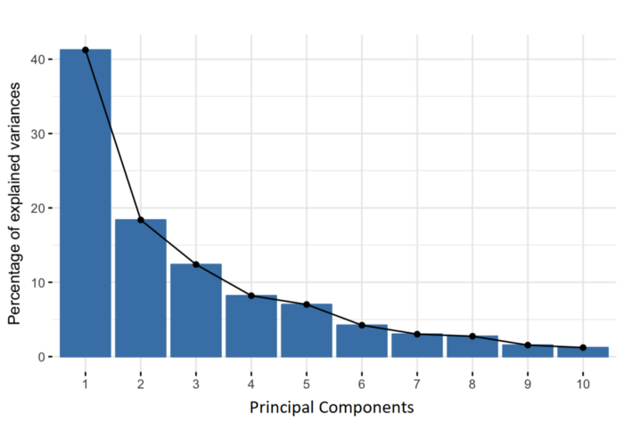
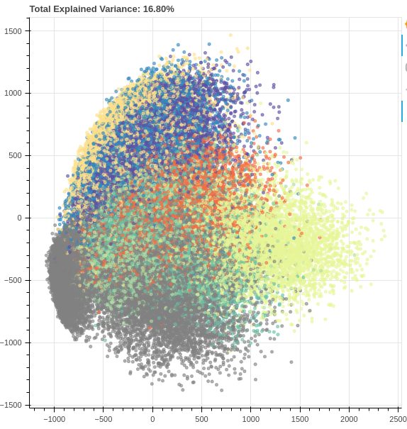
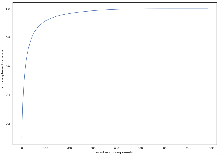
In the image above we see the results of applying PCA to the MNIST dataset of handwritten digits (784 to 2 dimensions). Although we see some separation between examples, with only two components we retain only ~16% of the original variation, which is not enough for any spectacular results. But although PCA doesn’t give us satisfactory results in this example for the purpose of visualization, it should be noted that after setting the number of components to 331, the percentage of variation was ~99%, which means that we managed to reduce the number of dimensions by more than a half with almost no loss of information. This clearly tells us that even though PCA may not always be the most suitable for visualization, it can be very helpful in solving some other problems, such as the (in)famous problem of the so-called “curse of dimensionality” (as the number of features grows, the amount of data we need for a machine learning model to perform well grows exponentially).
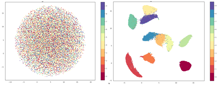
t-SNE (t-distributed Stochastic Neighbor Embedding)
t-SNE is an unsupervised, nonlinear technique for visualization of high-dimensional data. Unlike PCA, which, in addition to visualization, can be used for dimensionality reduction for purposes other than visualization, t-SNE’s main purpose is precisely visualization. For the detailed explanation of how t-SNE works, the best reference is the original paper, but very simply put, it creates a probability distribution in a high-dimensional space (meaning if we pick a point in the dataset, we define the probability that another point we pick is its neighbor).
A low-dimensional space is then created that has the same (or as similar as possible) probability distribution. Unlike PCA, t-SNE minimizes the distances between similar points and ignores the distant ones (so-called “local embedding”). What is also different is that t-SNE has hyperparameters with which we can significantly influence the end result. The most important one is perplexity, a parameter with which we give the algorithm the expected number of close neighbors that each point should have. Typical values for perplexity are between 5 and 50. It is also important to note that t-SNE is very slow and in order to be useable in a reasonable amount of time, it is often necessary to first preprocess that data using PCA or some similar method to reduce the dimension of the dataset.
UMAP (Uniform Manifold Approximation and Projection)
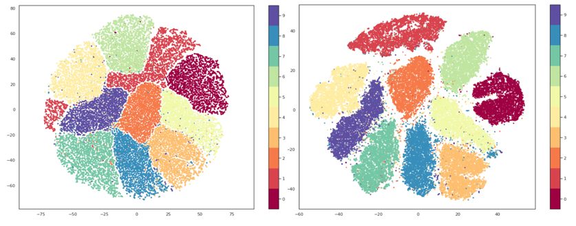
Similar to t-SNE, UMAP is a nonlinear dimensionality reduction method. It is very effective in visualizing clusters and their relative proximities and, unlike t-SNE, doesn’t suffer from issues with slow performance so no preprocessing is necessary. As with t-SNE I won’t go into the mathematical background of the algorithm, but an interested reader can study it in the original paper.
In the way they both function, UMAP and t-SNE are very similar, main difference being the interpretation of the distances between clusters. With t-SNE, only local structures in the data are preserved, while UMAP preservers both local and global structures. This means that with t-SNE we cannot interpret the distances between clusters, while with UMAP we can, i.e. if we are observing three clusters on a graph made using t-SNE, we cannot make any assumptions about whether two of these clusters are more similar just based on their distance on the graph, while using UMAP we should be able to make that assumption.
Precisely because of this, as well as because of its greater speed of execution, UMAP is generally considered a more effective solution for visualization compared to t-SNE. UMAP also has a hyperparameter n_neighbors which serves roughly the same purpose to the perplexity parameter of t-SNE. This parameter determines the number of nearest neighbors that will be used in the creation of the initial high-dimensional graph, i.e. it controls how UMAP will balance local and global structures. Lower values will focus more on local structures, limiting the number of neighboring points that will be considered when analyzing the data, while higher values will shift the focus to “big-picture” structures, losing some of the subtler details.
Conclusion
From everything mentioned so far, it would be easy to assume that UMAP is the best, followed by t-SNE and then PCA, but things are never that simple. For this purpose, PCA did a worse job than the other two methods, but visualization isn’t its only objective. Among other things, PCA can be a powerful tool while combating the previously mentioned “curse of dimensionality”, but it still seems that UMAP gives a better balance between local and global structures and, thanks to innovative solutions for efficient creation of approximate estimates of high-dimensional graphs instead of measuring each individual point, it can save us a great deal of time. However, one should always be aware that every problem is unique and there is no “magic bullet” for everything so finding solutions to different problems should always be approached individually.
References: